前引
在小程序项目中经常有要自定义navbar的需求,网上有很多大佬分享的教程,但有的不太兼容,有的又写的比较麻烦,这里分享一种本人在用兼容性较好而且代码比较简单的一种写法。
原理解释
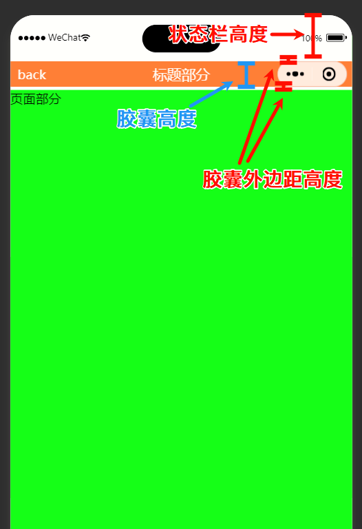
微信小程序navbar头部可以拆分为几部分构成:状态栏高度、胶囊高度、胶囊上下两侧外边距高度 。如下图所示:

只要能取到各个部分的值,定位navbar和设置高度都会十分简单。
获取状态栏高度
1
2
| const systemInfo = wx.getWindowInfo();
systemInfo.statusBarHeight
|
胶囊按钮高度
用胶囊按钮的bottom - top
1
2
| const menuButtonInfo = wx.getMenuButtonBoundingClientRect();
menuButtonInfo.bottom - menuButtonInfo.top
|
胶囊按钮的上下外边距
1
| menuButtonInfo.top - systemInfo.statusBarHeight
|
完整代码
ts代码
1
2
3
4
5
6
7
8
9
10
11
12
13
14
15
16
17
18
19
20
| Component({
data: {
navHeight: 0,
navWidth: 0,
navMarginY: 0,
statusBarHeight: 0,
},
lifetimes: {
attached() {
const systemInfo = wx.getWindowInfo();
const menuButtonInfo = wx.getMenuButtonBoundingClientRect();
this.setData({
statusBarHeight: systemInfo.statusBarHeight,
navHeight: menuButtonInfo.bottom - menuButtonInfo.top,
navMarginY: menuButtonInfo.top - systemInfo.statusBarHeight,
navWidth: systemInfo.screenWidth - menuButtonInfo.right + menuButtonInfo.left - 10,
})
},
},
})
|
wxml代码
1
2
3
4
5
6
| <view class="nav-box" style="padding-top: {{statusBarHeight}}px;">
<view style="height: {{navHeight}}px; margin: {{navMarginY}}px 0; " class="navbar">
<view>back</view>
<view class="title">标题部分</view>
</view>
</view>
|
wxss代码
1
2
3
4
5
6
7
8
9
10
11
12
13
14
15
16
17
18
19
20
21
| .navbar {
position: relative;
display: flex;
align-items: center;
background-color: coral;
color: #ffffff;
padding: 0 16rpx;
box-sizing: border-box;
}
.navbar .title {
position: absolute;
top: 0;
left: 0;
height: 100%;
width: 100%;
display: flex;
justify-content: center;
align-items: center;
font-size: 32rpx;
}
|
这只是一个介绍原理的简单示例,具体代码要根据业务需求来做出修改